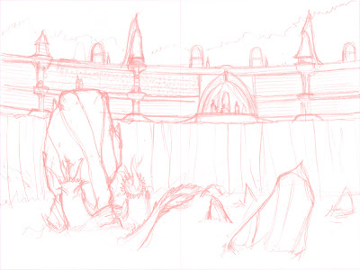
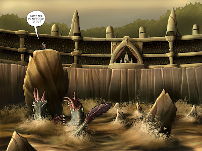
So, I have been working on another pitch for a graphic novel that is under the working title of The King’s Game. I thought it would be fun to share with you all the first completed page and show you how I did it. Let’s start with the original image:
 This was my first concept of what the page would look like. I had the idea of it being a small coliseum with a water pit and you wouldn’t see any of the creatures in the water until later when our hero’s ended up in it. The image was useful for the the intimacy of the event, but eventually I thought (and with other great input from friends and artists) it needed to be more epic feeling. I then got the idea of putting the whole thing out on an open ocean with a coliseum built on the edge of a rock face which lead to this:
 These are my original pencils for the page. I do this all on 8.5 paper. It helps me see the scope of everything in a smaller way. I get lost on a larger format. I take these loose scribblings and scan them into the computer.
 As you may have seen in an earlier post on my Bounty Hunter drawing, I then convert these lines to red line art in PS using a fill layer and set the layer to Screen. This will turn all of my lines into the shade of red I want. From there I print this out on two pieces of bristol card stock and tap the pages together so I can do the inks. I stick to this format for now because its what my printer handles with ease and I don’t think it hurts the final product.
 After I’ve inked the whole thing I scan it into PS and removed the red line art using the Hue/Saturation tool. Then I do some clean ups using a soft white airbrush set to color dodge nd the opacity turned down to 14. This lets me pick up small artifacts that remain after the red has been pulled out and holds up the darker intended lines.
 The next step is to Flat the page. This is basically breaking down all of the shapes into layer groups for easy selection. I can then paint freely on one object without fear of it impacting the others around it.
 Even more important than color in a painting is the values of the colors. These help things recede and push forward. You can use temperatures to do this as well, but value that works well can create just as stunning of an image as one with vibrant color. Even more so if the artist has no sense of values. So what I’ve done is started using a fill layer set to a middle gray tone and the layer set to color. I put this on top of everything and will constantly toggle back to it as a way of checking if things are separating like they should and if my focal point is working correctly. I caught a lot of stuff this way.
And finally:
 I complete the painting. This thing kicked my butt. I pushed myself hard on this and I think the result is better than I imagined. Its got me excited for the rest of the scene coming up and with this image in place, I’m set to start painting the rest of the scene.
wow… micheal you are awesome!!!!
Very cool Micheal! I'll be interested to learn more. I think the page came out real good. You bring up a good point about push and pull with value, it's something I am horrible at – always good to be reminded of such things.
I have to wonder why you just don't pencil with a red/blue pencil to start with? Why do the extra step?
I pencil in blue, then when I scan in my inks in True Gray at 600dpi, the scanner doesn't pick up the blue at all — there's ZERO cleanup on that. It works the same for red.
I can't but think you are spending way too much time futzing with those things unless there is some aspect I am missing. As creators our time is so precious, I hate to see you doing something that isn't necessary!
Its actually quite the opposite Tom. I work at a smaller scale for my pencils than I do for my finished art. This lets me work faster and make quicker corrections than if I did the whole thing on full scale. I've been using this process for about six months now and my production rate has soared. I've completed about fifty pages of finished inks during that time most of which was done in a two month period and where I was completing easily eight pages a week.
I used to do everything on the board with a blue pencil, but for whatever reason this process has worked well for me. Its actually a very similar process to what Kazu uses for his work on Amulet. It really is about finding what works best for each person I think. I've toyed around with so many different ways of doing this over the years and this one gets it done faster for me and gives me the finished quality I want.
And thanks Karrie!
That's really interesting. I have an incredibly difficult time penciling things that are small. At one point I was working at 2x normal size – similar to what Charles Schulz did, but I found that was too much.
It sounds like your initial pencils are not super tight then? Maybe the size forces you to not overwork things, and I can see that being good.
Exactly, I work super loosely on my pencils. They are guides, not set rules. But I feel freer when I can pencil on a template that isn't my final page, because I can make all of the mistakes in the world. Hopefully I get the energy and scale I want, but if I miss it I can adjust in PS before printing out the reds or blues to my art board for inking. It really is a fluid process that sounds complicated but barely takes much time to do once you're doing it.
Very nice, Michael. Great painting!
Thanks, Steve! I think I'm figuring out a thing or two.